
Monday, February 22, 2010
Color schemes: blue and green
I love the colors they're using for the Winter Olympics:

This is a random curling photo I ganked from someplace; I picked it because you can see the wall of the ice rink pretty well in it. This same design (or at least a very similar one) seems to be on all the ice rinks and painted on fences, etc, all over the place. If you've watched any ice skating, you've seen the one there. I just think it's really beautiful. Blue and green is not a color scheme that's been extremely popular in recent years, but it's one I always liked. Water and earth, I guess.
Friday, February 19, 2010
Whee!
OMG, I got a listed in a Treasury! My first one!

Thanks to corkycrafts for including me! (And I seriously crave a couple of those other pieces there...)

Thanks to corkycrafts for including me! (And I seriously crave a couple of those other pieces there...)
Tuesday, February 16, 2010
Color trends - Target edition
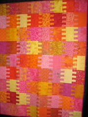
So I went to Target today and one of the things I noticed was a lot of stuff in my favorite pink/orange/yellow combination. The picture here is one of the last quilts I finished (which was a couple of years ago now). I came up with this combination sort of by accident, and at the time I thought I'd come up with something really original. But what I've noticed since then is that I've seen this combination more and more. Anyway, it's a great spring color scheme and I'd love to have more of it. Hmm, I need to look to see what I can do with that, bead-wise!
(Reminder to myself: I need to get this quilt and put it somewhere I can see it for spring!)
(Reminder to myself: I need to get this quilt and put it somewhere I can see it for spring!)
Color trends - really expensive handbag edition
I have been keeping an eye on The Purse Blog lately even though I am far too cheap to ever consider paying for even the cheapest of their purses (which are mostly in the thousands of dollars; this is really the very high end we're talking about here), and despite the fact I think a good many popular bag designs are pretty darn fugly. But it's a way to keep an eye on color trends and such, and I've seen a number of things lately that I do like a lot. This orchid (or grape) color is delicious - and I also really love this muted tie-dye effect. I'm not at all sure how you'd translate that latter one into jewelry, but I'm sure it could be done. And I'm definitely going to look for some beads in that orchid color.
Completely unrelated to anything: want to see something really adorable? Take a look at Lisa's Icelandic sheepdog puppies. I'm a cat person, in general, but who can resist puppies?
Completely unrelated to anything: want to see something really adorable? Take a look at Lisa's Icelandic sheepdog puppies. I'm a cat person, in general, but who can resist puppies?
Saturday, February 13, 2010
Red and pink
Does anybody but me dislike red roses? I mean, there's not anything really wrong with them per se, they're just kind of boring. Especially at Valentine's Day, when it's hard to find anything but. So I was happy to see this article at D*S with something different: black hearts. Which are really beautiful.
The colors you see this time of year are pretty boring, on the whole. Valentine's stuff tends to be bright red and just a couple of shades of pink (and then the roses, which are not really bright red but a couple of shades darker - I guess true bright red roses are not an easy thing to achieve). I like red, and I like pink, too, I just think that people who make commercial Valentine merchandise could be a little more imaginative about the colors they use.
The colors you see this time of year are pretty boring, on the whole. Valentine's stuff tends to be bright red and just a couple of shades of pink (and then the roses, which are not really bright red but a couple of shades darker - I guess true bright red roses are not an easy thing to achieve). I like red, and I like pink, too, I just think that people who make commercial Valentine merchandise could be a little more imaginative about the colors they use.
Thursday, February 11, 2010
More Valentines
Cute heart pins from Margot Potter (and some permission-free vintage images to use with them!)
Beaded heart suncatcher from Ornamentea - there's no pattern but it looks like you'd be able to wing it pretty easily.
Sand Fibers has great downloadable heart cuff patterns and a sale on things with a heart on them!
I suppose it's too late to get other online purchases in time for V-day unless you pay for express shipping or something (which is why I've been concentrating on posting links to tutorials instead) but Chinook Jewelry's hearts are the cutest thing ever. And it's not like you can't wear them the rest of the year, of course!
Adorable valentine images at The Graphics Fairy
Valentines from Alexa at The Swell Life
Labels for Valentine CDs from the nice Chronicle Books people
As for me, I have not actually done any Valentine crafts this year, nor have I sent anybody cards, which I do most years. Instead, I have been painting paper-mache eggs. Go figure. I have been experimenting and don't really have too much finished yet, but I am not going to post any pictures of those until closer to Easter, in any case. So you just get to wonder about what I'm up to for a while! (I'm sure you're gonna be on pins & needles...)
Monday, February 8, 2010
Valentine crafts
Highlights found on Google Reader:
A candy box full of flowers. Gorgeous!
Really cute heart gift tags
Decoupage hearts
Monet-inspired heart
Mailbox for your valentines
(I'll find more as soon as I post this, but I'll stop. For now.)
A candy box full of flowers. Gorgeous!
Really cute heart gift tags
Decoupage hearts
Monet-inspired heart
Mailbox for your valentines
(I'll find more as soon as I post this, but I'll stop. For now.)
Friday, February 5, 2010
Made by the Na'vi
I found another example of movie-branded jewelry: Avatar. (Figures.) I kinda like the armband, although I would never wear such a thing - seems like it would be uncomfortable, somehow. Plus I didn't really even like the movie that much. (Very pretty to look at, very short on plot.)
Monday, February 1, 2010
Vampire couture
I'm still being all obsessed with True Blood, so it's not surprising that I noticed the jewelry some of the characters are wearing, I guess:

This is from Season 1, the first time we see the vampire bar Fangtasia. In the book, it's explained that these vampire bars are wildly successful because they cater to tourists and "fangbangers" (basically, vampire groupies) and so to make it work, the local vampires have to spend a certain amount of time a week sitting around in the bar looking all broody and vampire-ish, playing on human expectations of how vampires look and act. So it makes a good bit of sense that this necklace and earring set, while cute, looks like it's something that came from Macy's or somewhere. (Hot Topic, maybe.) Actually I swear I've seen it before.
(In the same scenes, the human heroine Sookie wears a red-and-white sundress and a really cute pair of tiny red dangly earrings. So she's color-coordinated but sort of anti-goth.)
(Picture from a screencap.)
Subscribe to:
Posts (Atom)