It just occurred to me that I never did post the picture of my latest bit of classwork here:
This is a resist done with a watermark stamp and painted over. I actually used a Perfect Medium stamp, because I couldn't find the Ranger Watermark inkpad that was recommended, but the one I had worked just fine. (The class consensus, though, is that Versamark, which is another brand of clear ink, does not work as well, for some reason. I didn't try it myself.) You stamp on the painted background, and then paint over it with watered down acrylic paint before it dries. The black is the paint, which wasn't dry yet when I took this picture; the blue is the stamped image, showing through from the painted background. It's a neat technique. I can think of all sorts of uses for this!
There were a couple more techniques for this week - a distressing technique that also used the watermark stamp pad, and stamping with paint onto canvas. I have had mixed results with that last one, so I'm still playing with it. You're supposed to spray water on it, and the first time I forgot it completely, and the second time I think I used too much. I'll get it right eventually!
Wednesday, July 14, 2010
Tuesday, July 13, 2010
One more thing about Twilight
I knew this existed, but I was too lazy to look it up, and then Cleolinda did the work for me by providing links right on her Twitter feed: Twilight in 15 minutes. She actually linked to the new one (Eclipse in 15 Minutes), of course, but there were helpful links right there to the others, so I'm golden. And it is, as usual, very funny.
If you've never read any of Cleolinda's parodies, she's been posting them on Livejournal for years, and she even has a book, which has completely different parodies than the LJ ones, although it's now out of print (but I'll post an Amazon link anyway). (She also writes this almost unexplainable thing called The Secret Life of Dolls which I totally adore, and wish she would write more of. Cleolinda is totally to blame for me ever deciding to watch Twilight in the first place.)
Added: At my husband's suggestion, we checked out one more piece of Twilight mockery after I wrote this: Rifftrax, from the Mystery Science Theater guys. It's downloadable audio which you then synch up with the video - the effect is like MST3K minus the robot silhouettes. It was the first time we'd tried it but it worked quite well. For $3.99, it was a fun bit of entertainment.
If you've never read any of Cleolinda's parodies, she's been posting them on Livejournal for years, and she even has a book, which has completely different parodies than the LJ ones, although it's now out of print (but I'll post an Amazon link anyway). (She also writes this almost unexplainable thing called The Secret Life of Dolls which I totally adore, and wish she would write more of. Cleolinda is totally to blame for me ever deciding to watch Twilight in the first place.)
Added: At my husband's suggestion, we checked out one more piece of Twilight mockery after I wrote this: Rifftrax, from the Mystery Science Theater guys. It's downloadable audio which you then synch up with the video - the effect is like MST3K minus the robot silhouettes. It was the first time we'd tried it but it worked quite well. For $3.99, it was a fun bit of entertainment.
Monday, July 12, 2010
Administrivia
(I don't know where I stole "administrivia" from - somebody I read somewhere uses it though. I'd guess it was my friend Col; at least it sounds like him. In any case, it always seems very apropos.)
I just wanted to say, what with my readership apparently burgeoning and everything - I have nine whole followers now! - that I am so far resisting changing my comment settings, even though I have been picking up some (apparent) comment spam. So here is my rule: if you make a comment with no noticeable connection whatsoever to the subject matter, and you're not somebody I know in the slightest, and it has a link in it (or alternatively if it's entirely in a script I can't read, like Chinese, and it has a link) with no apparent connection, either, then I am going to assume you're a spammer and delete it, if I notice. Just to clarify. Relevant links are fine, and are in fact encouraged. I love links, in general. I'd just ideally like my comment section not to be a big swamp of spam.
I also worked on my sidebar a little - I added a few papercraft stores that I particularly like, and rearranged things a bit. As always, it's a work in progress!
I just wanted to say, what with my readership apparently burgeoning and everything - I have nine whole followers now! - that I am so far resisting changing my comment settings, even though I have been picking up some (apparent) comment spam. So here is my rule: if you make a comment with no noticeable connection whatsoever to the subject matter, and you're not somebody I know in the slightest, and it has a link in it (or alternatively if it's entirely in a script I can't read, like Chinese, and it has a link) with no apparent connection, either, then I am going to assume you're a spammer and delete it, if I notice. Just to clarify. Relevant links are fine, and are in fact encouraged. I love links, in general. I'd just ideally like my comment section not to be a big swamp of spam.
I also worked on my sidebar a little - I added a few papercraft stores that I particularly like, and rearranged things a bit. As always, it's a work in progress!
Those sparkly vampires
I'm doing something I never quite thought I'd do - I'm watching Twilight. It's not really my thing, but I was curious. It's become such a pop-culture legend, you know? And I guess I can see why the teenage girls are all into it - it's that whole doooooomed romance thing, I think. I might be more into it if Robert Pattinson was more my type, but he doesn't really do it for me. I don't know why, exactly, because I do think he's good-looking. I think it's partly that I think his hair is stupid. Taylor Lautner comes closer, but I think that may also be the hair, because I'm well aware that I have a thing for long hair (which in turn shows my age, I think - I hit adolescence in the 70s, when long hair on guys was all the rage). (Then I looked the movie up on IMDb, and now I feel like a pervert - Taylor Lautner is eighteen. He was born in 1992, for god's sake. Which means he was, what, 15 or so when this was filmed. But like I said, I think it's the hair. Teenage boys are usually not my thing, not at all. And it's not like I'm ready to go join Team Jacob or anything. And anyway, I think he loses the long hair in later movies, doesn't he? I don't remember ever seeing pictures of him with long hair at all, although I'm sure I just didn't pay attention at the time this came out.)
Anyway, I am trying not to mock the movie overall - it's really not as bad as I expected. Even the part where Edward sparkles, which is probably the most obviously mockable part, was done in a relatively subtle way, somewhat to my surprise. And the sparkling is in the book, right? so they pretty much had to have it in. I did sort of enjoy this, and I'm not entirely ruling out watching New Moon someday, but I'm pretty sure I'm not masochistic enough to read the books, still. So I am gonna have to rely on other people to tell me what's in the books. -- And if you're a huge fan of the books, don't hit me, okay? I'm just pretty sure that would be too much of Bella moping for me to take.
I'm sure this is a surprise to absolutely nobody, but there is, of course, Twilight jewelry. I had to look. And I saw a very clever Twilight card tutorial the other day, if I can remember where I saw it. (Aha - here.) I know there's Twilight merchandise out the wazoo, but that's as far as I'm willing to look. I'll go back to my book now. (Which The Pillars of the Earth
, if you really want to know, but I just started it so I have no real opinion yet. I've had it for ages and keep forgetting about it.)
Anyway, I am trying not to mock the movie overall - it's really not as bad as I expected. Even the part where Edward sparkles, which is probably the most obviously mockable part, was done in a relatively subtle way, somewhat to my surprise. And the sparkling is in the book, right? so they pretty much had to have it in. I did sort of enjoy this, and I'm not entirely ruling out watching New Moon someday, but I'm pretty sure I'm not masochistic enough to read the books, still. So I am gonna have to rely on other people to tell me what's in the books. -- And if you're a huge fan of the books, don't hit me, okay? I'm just pretty sure that would be too much of Bella moping for me to take.
I'm sure this is a surprise to absolutely nobody, but there is, of course, Twilight jewelry. I had to look. And I saw a very clever Twilight card tutorial the other day, if I can remember where I saw it. (Aha - here.) I know there's Twilight merchandise out the wazoo, but that's as far as I'm willing to look. I'll go back to my book now. (Which The Pillars of the Earth
Saturday, July 10, 2010
Color trends - wedding dresses
I don't know that this is actually a trend, but I'm hoping:
Because I get so bored with wedding dresses. What would you call that color, sort of a pale taupe? It seems a little more grayed-out to me than a pure sand color. Anyway, whatever it is, I like it. Plus look, it has sleeves, even if they're only little bitty things. Honestly, have you seen anybody wear a wedding dress with sleeves in the last decade? I can't think of any, although admittedly I don't go to all that many weddings.
(From the Purse Blog - who doesn't seem to stay with the subject of purses with much more consistency than I stay with beads!)
Maybe I feel so strongly about this because I had a not-so-secret yen for a wedding dress that wasn't white or off-white: the color I had in mind at the time was very pale blush pink. But this was in 1987, and there was no internet, and you just couldn't find anything but white or off-white that still looked like a formal wedding dress. I was traditional enough to want a fancy wedding dress but untraditional enough to think about varying the color, at least. And short of dyeing the fabric myself, or something (which was also pretty unheard of back then), it just wasn't to be had. (Actually a year or two later, the very pale pastel dresses started turning up in wedding magazines, you would know. Just a little too late for me!)
Because I get so bored with wedding dresses. What would you call that color, sort of a pale taupe? It seems a little more grayed-out to me than a pure sand color. Anyway, whatever it is, I like it. Plus look, it has sleeves, even if they're only little bitty things. Honestly, have you seen anybody wear a wedding dress with sleeves in the last decade? I can't think of any, although admittedly I don't go to all that many weddings.
(From the Purse Blog - who doesn't seem to stay with the subject of purses with much more consistency than I stay with beads!)
Maybe I feel so strongly about this because I had a not-so-secret yen for a wedding dress that wasn't white or off-white: the color I had in mind at the time was very pale blush pink. But this was in 1987, and there was no internet, and you just couldn't find anything but white or off-white that still looked like a formal wedding dress. I was traditional enough to want a fancy wedding dress but untraditional enough to think about varying the color, at least. And short of dyeing the fabric myself, or something (which was also pretty unheard of back then), it just wasn't to be had. (Actually a year or two later, the very pale pastel dresses started turning up in wedding magazines, you would know. Just a little too late for me!)
Thursday, July 8, 2010
Stuff I bought at Paper Source
Warning: this is one of my periodic, slightly excessive I-went-shopping-and-here's-everything-I-bought posts. Just so you know. (It could be worse, much worse - at least I don't get around to doing this every time I go shopping!)
----------------------------------------------------------------------------------
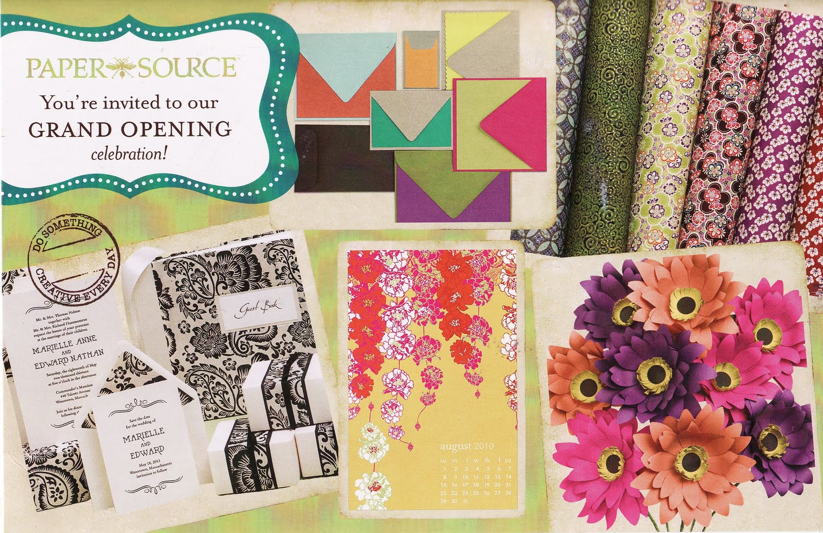
Just last night, this postcard came in the mail:
But as it happens, I already knew that the Paper Source store in Houston was opening, and in fact is already open, and I went there yesterday. I knew it was coming - the store, that is, not the postcard - because I still get their catalogs in the mail (despite the fact that I really don't think I've ordered from them in some time) and I noticed a while back that Houston was listed in the "coming soon" list - which I was ridiculously excited about. I probably would have been even more excited, except that I have been in a Paper Source store before - the one in Dallas, back in December - so I did know what to expect. That was enough to keep me from going completely ballistic, I guess.
The Houston store is actually not as big as the Dallas store, I don't think - the Dallas store is in a mall and the Houston store is right on the street on Westheimer, which might be more expensive real estate - but it's got the stuff it needs to have and it's really adorable. It's a brand-new building (just west of Crate and Barrel, for any local people who happen to be reading) and it's tall and narrow and made to look fairly convincingly like a brownstone. (Hmm, I wonder if the classroom is upstairs, actually - I didn't think of that before. If it's downstairs I sure didn't see it!)
So this is what I bought:
really cool paper:
http://www.paper-source.com/cgi-bin/paper/item/Purple-Silver-Paisley-Fine-Paper/300_621/103320.html - this looks woven, almost like it's a fabric
http://www.paper-source.com/cgi-bin/paper/item/Pixel-Wrapping-Paper/3650.040/459889.html - the picture does not do this justice. I am a color junkie and this is so right up my alley.
plus a paper sampler (sort of like this one):
http://www.paper-source.com/cgi-bin/paper/item/Paper-Scrap-Bag-Warm-Colors/3325.020/39999844.html The one I got is heavy on bright pinks and yellows, colors that are really appealing to me these days!
a Halloween stamp:
http://www.paper-source.com/cgi-bin/paper/item/Happy-Halloween-Rubber-Stamp/2901.015/805840.html
red embossing powder:
http://www.paper-source.com/cgi-bin/paper/item/Zing-Opaque-Rouge-Embossing-Powder/2902.011/718813271233.html (that doesn't seem to be exactly the same color I got, though, unless the picture is bad - mine is bright bright red)
plus some useful but somewhat more mundane stuff that I won't link, like Staz-On stamp cleaner and a Versamark pen. (Really I restrained myself admirably, on the whole!)
I have no idea what I'm doing with either one of the papers but I'll think of something! The Halloween stuff was because I seem to be going on an early Halloween bender - which might be okay because I need to start making some skull jewelry if I really intend to sell some this year like I said I was going to. The red embossing powder is just because it appealed to me and I am just starting to experiment with embossing and so practically anything I buy is going to be new to me.
I remembered - after thinking about it for a minute - why I found Paper Source in the first place, long before I got interested in papercrafts in any kind of half-serious way. It was the heart cards. I don't know if I saw a link somewhere or maybe saw them in a magazine, but somehow I found out about them and ordered some heart cards and some envelopes. I sent them the first year with just "Happy Valentine's Day" handwritten on them, and then I sent them again some later year with this stamped on them. It was the first stamp that I ever colored. I've ordered various other things from them since them, but that was where I started.
(The official grand opening is not until July 24th, incidentally. Just in case you're interested in going.)
----------------------------------------------------------------------------------
Just last night, this postcard came in the mail:
But as it happens, I already knew that the Paper Source store in Houston was opening, and in fact is already open, and I went there yesterday. I knew it was coming - the store, that is, not the postcard - because I still get their catalogs in the mail (despite the fact that I really don't think I've ordered from them in some time) and I noticed a while back that Houston was listed in the "coming soon" list - which I was ridiculously excited about. I probably would have been even more excited, except that I have been in a Paper Source store before - the one in Dallas, back in December - so I did know what to expect. That was enough to keep me from going completely ballistic, I guess.
The Houston store is actually not as big as the Dallas store, I don't think - the Dallas store is in a mall and the Houston store is right on the street on Westheimer, which might be more expensive real estate - but it's got the stuff it needs to have and it's really adorable. It's a brand-new building (just west of Crate and Barrel, for any local people who happen to be reading) and it's tall and narrow and made to look fairly convincingly like a brownstone. (Hmm, I wonder if the classroom is upstairs, actually - I didn't think of that before. If it's downstairs I sure didn't see it!)
So this is what I bought:
really cool paper:
http://www.paper-source.com/cgi-bin/paper/item/Purple-Silver-Paisley-Fine-Paper/300_621/103320.html - this looks woven, almost like it's a fabric
http://www.paper-source.com/cgi-bin/paper/item/Pixel-Wrapping-Paper/3650.040/459889.html - the picture does not do this justice. I am a color junkie and this is so right up my alley.
plus a paper sampler (sort of like this one):
http://www.paper-source.com/cgi-bin/paper/item/Paper-Scrap-Bag-Warm-Colors/3325.020/39999844.html The one I got is heavy on bright pinks and yellows, colors that are really appealing to me these days!
a Halloween stamp:
http://www.paper-source.com/cgi-bin/paper/item/Happy-Halloween-Rubber-Stamp/2901.015/805840.html
red embossing powder:
http://www.paper-source.com/cgi-bin/paper/item/Zing-Opaque-Rouge-Embossing-Powder/2902.011/718813271233.html (that doesn't seem to be exactly the same color I got, though, unless the picture is bad - mine is bright bright red)
plus some useful but somewhat more mundane stuff that I won't link, like Staz-On stamp cleaner and a Versamark pen. (Really I restrained myself admirably, on the whole!)
I have no idea what I'm doing with either one of the papers but I'll think of something! The Halloween stuff was because I seem to be going on an early Halloween bender - which might be okay because I need to start making some skull jewelry if I really intend to sell some this year like I said I was going to. The red embossing powder is just because it appealed to me and I am just starting to experiment with embossing and so practically anything I buy is going to be new to me.
I remembered - after thinking about it for a minute - why I found Paper Source in the first place, long before I got interested in papercrafts in any kind of half-serious way. It was the heart cards. I don't know if I saw a link somewhere or maybe saw them in a magazine, but somehow I found out about them and ordered some heart cards and some envelopes. I sent them the first year with just "Happy Valentine's Day" handwritten on them, and then I sent them again some later year with this stamped on them. It was the first stamp that I ever colored. I've ordered various other things from them since them, but that was where I started.
(The official grand opening is not until July 24th, incidentally. Just in case you're interested in going.)
Tuesday, July 6, 2010
A new kind of donut
Those of you who've been reading here a while may remember that I have a weakness for donuts - the jewelry kind, that is. And on a related subject (the relationship will become clear in just a minute), I have been resisting playing around with Suze Weinberg's Melt Art techniques, even though I like a lot of the stuff she does with it, because I'd have to buy a good many more supplies and I've already bought about a metric ton of supplies lately. But in one of her blog entries lately she showed UTEE donuts (they're at the bottom of that page) that are about 2" tall, made with a mini-donut pan, that really tempt me. I may have to try that at some point soon. Darnit.
Monday, July 5, 2010
Happy belated 4th of July!
I read somewhere that doilies are coming back into fashion, and that reminded of me of this little quilt of my mom's:
I think she got the pattern at the International Quilt Festival some years back. I always thought it was a very clever idea.
(I have a whole collection of pictures of my mom's quilts on Flickr, if you're interested - here.)
I think she got the pattern at the International Quilt Festival some years back. I always thought it was a very clever idea.
(I have a whole collection of pictures of my mom's quilts on Flickr, if you're interested - here.)
Seasons
This was the weekly project for my class and I am really in love with it. The green on the tree - and the grass - was my own addition - the main technique for the week was doing gesso transfer, and the practice picture we had was this tree, but it was just black and white. I went to Michael's and bought this little 5x5" canvas on sale, and then I loved the results so much that I went back the next day before the sale ended and bought three more so I could do a set.
Actually when I bought the additional canvases (on Saturday) I was just thinking that I would do four different pictures - but now I have changed my mind and I'm pretty sure I'm going to do the same picture four times and make it the four seasons. I'm still mulling over what colors to use but I think I may darken the greens in the tree a little bit and use this one as Summer. I'm waffling, though, because I'm a little afraid of messing it up and it's so perfectly spring green right now. This is actually Claudine's Landscape Green paint, straight out of the bottle, except with a little Extra Time mixed in for the background. I didn't mix it in very well and it made it paint on just a little bit streaky. Which I really liked. (And then I painted the tree with my finger, instead of with a brush.)
And all of this makes me mull over the question of seasons, generally. I live in Texas and I think that makes my idea of seasons a little skewed. I have been known to say that the seasons here are Hot, Hotter, Not-quite-so-hot, and Sorta-chilly. (At least where I live. We don't usually have much of a winter down here.) Things bloom most in the spring, and by the time it's really summer, the flowers are usually mostly gone, the trees are really dark green, and the grass is turning yellow, half the time. Except for the redbuds. Maybe I'll try to do a redbud for summer. (As far as fall? If we have a real one at all, the trees turn somewhere between Thanksgiving and Christmas. And usually it's blazing hot right up til Halloween or so.)
Here's the link to the paint, just so you know what I'm talking about! (Also, this same color is very visible in the first picture in the entry right below this one, as the background to my earrings I made.
Actually when I bought the additional canvases (on Saturday) I was just thinking that I would do four different pictures - but now I have changed my mind and I'm pretty sure I'm going to do the same picture four times and make it the four seasons. I'm still mulling over what colors to use but I think I may darken the greens in the tree a little bit and use this one as Summer. I'm waffling, though, because I'm a little afraid of messing it up and it's so perfectly spring green right now. This is actually Claudine's Landscape Green paint, straight out of the bottle, except with a little Extra Time mixed in for the background. I didn't mix it in very well and it made it paint on just a little bit streaky. Which I really liked. (And then I painted the tree with my finger, instead of with a brush.)
And all of this makes me mull over the question of seasons, generally. I live in Texas and I think that makes my idea of seasons a little skewed. I have been known to say that the seasons here are Hot, Hotter, Not-quite-so-hot, and Sorta-chilly. (At least where I live. We don't usually have much of a winter down here.) Things bloom most in the spring, and by the time it's really summer, the flowers are usually mostly gone, the trees are really dark green, and the grass is turning yellow, half the time. Except for the redbuds. Maybe I'll try to do a redbud for summer. (As far as fall? If we have a real one at all, the trees turn somewhere between Thanksgiving and Christmas. And usually it's blazing hot right up til Halloween or so.)
Here's the link to the paint, just so you know what I'm talking about! (Also, this same color is very visible in the first picture in the entry right below this one, as the background to my earrings I made.
Friday, July 2, 2010
Tattoo earrings, and fun with Patera
I made these earrings a couple of days ago and I really like them - they look adorable on. They are not all that long, but they swing around just enough, as far as I'm concerned. Enough to be a bit eye-catching, I guess you'd say, without being so big they bother me.
I'm having a terrible time getting decent pictures of any of my pendants, but here's one:
This is one of the first ones I did with diamond glaze. I like it despite its imperfections - the resin is wavy and dips in the middle and kind of slops over the edges a bit. But it still looks cute, and that's what matters, right? It's a little over an inch wide - I think it came on a fancier chain, actually, and I decided it was too formal for this piece and went with plain old bead chain. I'll use the fancy one for something else!
(Added: if you click on the link below the next picture, you can see what I was calling the "fancy" chain - the one with the sort of vine motif.)
This next one is an especially bad picture, so I apologize in advance, but at least you can see the pieces:
These are little earrings (only about 1/2" wide) that basically came pre-made - wires on them and all, I mean - so all you have to do is put some artwork in there and seal it up. This artwork came from paperwishes.com - they have some books of artwork especially for jewelry, called "Easy Peasy", which are made to go with Patera findings and/or memory glass. I've been wearing these a lot.
This one is imperfect (like all of them) but I like it anyway. It has some match artwork which I bought on Stampington's download page (here) and then I added some glitter and some little microbeads. The artwork got sort of obscured by everything else, but it still looks cute and you can still tell it's a bird so oh well.
(Photo backgrounds courtesy of my Claudine Hellmuth class - we're making a little chipboard book so I put it to work already.)
I'm having a terrible time getting decent pictures of any of my pendants, but here's one:
This is one of the first ones I did with diamond glaze. I like it despite its imperfections - the resin is wavy and dips in the middle and kind of slops over the edges a bit. But it still looks cute, and that's what matters, right? It's a little over an inch wide - I think it came on a fancier chain, actually, and I decided it was too formal for this piece and went with plain old bead chain. I'll use the fancy one for something else!
(Added: if you click on the link below the next picture, you can see what I was calling the "fancy" chain - the one with the sort of vine motif.)
This next one is an especially bad picture, so I apologize in advance, but at least you can see the pieces:
These are little earrings (only about 1/2" wide) that basically came pre-made - wires on them and all, I mean - so all you have to do is put some artwork in there and seal it up. This artwork came from paperwishes.com - they have some books of artwork especially for jewelry, called "Easy Peasy", which are made to go with Patera findings and/or memory glass. I've been wearing these a lot.
This one is imperfect (like all of them) but I like it anyway. It has some match artwork which I bought on Stampington's download page (here) and then I added some glitter and some little microbeads. The artwork got sort of obscured by everything else, but it still looks cute and you can still tell it's a bird so oh well.
(Photo backgrounds courtesy of my Claudine Hellmuth class - we're making a little chipboard book so I put it to work already.)
Subscribe to:
Posts (Atom)